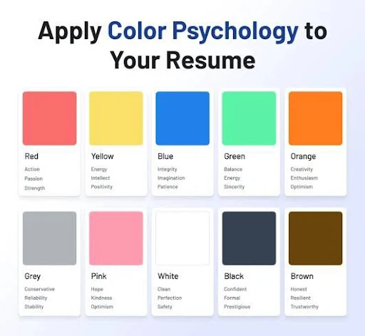
Should Resume be Colorful : What's and How
Here's a breakdown of when and how to use color on a resume:
- When to consider color:
- Creative Fields: If you're applying for a job in graphic design, animation, or other creative roles, a colorful resume can showcase your personality and skills.
- To Highlight Key Information: Subtle color can be used to draw attention to section headers, job titles, or important accomplishments.
- To Make Your Resume Stand Out: In a sea of black-and-white resumes, a well-designed, colorful resume can make a lasting impression.
- Creative Fields: If you're applying for a job in graphic design, animation, or other creative roles, a colorful resume can showcase your personality and skills.
- When to avoid color:
- Conservative Industries: In fields like finance, accounting, or law, a traditional black-and-white resume is often preferred.
- If You're Unsure: If you're not comfortable with the idea of using color, or if you're applying for a job where it might be seen as unprofessional, stick with a classic black-and-white design.
- Conservative Industries: In fields like finance, accounting, or law, a traditional black-and-white resume is often preferred.
- Tips for using color effectively:
- Choose Subtle Colors: Opt for muted or pastel shades rather than bright, distracting colors.
- Maintain Readability: Ensure that the text is easily readable against the background color.
- Use Color Consistently: If you choose to use color, use it consistently throughout your resume to create a cohesive look.
- Don't Overdo It: Too much color can make your resume look cluttered and unprofessional.
- Consider Your Industry: Tailor your color choices to the industry you're applying for.
- Check for ATS Compatibility: Make sure that the colors you choose won't interfere with applicant tracking systems (ATS) scanning your resume.
- Choose Subtle Colors: Opt for muted or pastel shades rather than bright, distracting colors.
- Examples of professional color choices
- choices:
- Subtle shades of blue, green, or gray .
- Using a complementary color for section headers .
- Highlighting keywords or achievements with a subtle color .
- Subtle shades of blue, green, or gray .
- Examples of unprofessional color choices:
- Bright, clashing colors .
- Using too many colors .
- Using colors that are difficult to read .
- Using a colorful background .
- Bright, clashing colors .

Comments
Post a Comment
"Thank you for seeking advice on your career journey! Our team is dedicated to providing personalized guidance on education and success. Please share your specific questions or concerns, and we'll assist you in navigating the path to a fulfilling and successful career."